Compact Hue/Tone Color Picker Sandbox
by Morgan Adams
swatches ( × ) for colors
including tones for each of hues, plus -level gray scale
RGB ()
#
HSB
visual brightness (Q)
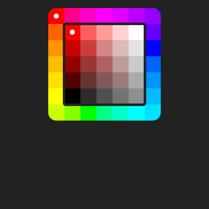
Design goal: a compact, intuitive set of color swatches covering the full range of possible colors
Change the number in the “Tones” box at the top to create a palette of any size, or try the Presets. This is not a polished application, but a place for me to experiment with numerous mathematical, coding, and design approaches to generating user-friendly color pickers. The defaults above are the approach I ended up favoring, but I left options to try all my other experiments as well. The code is a mess!
I programmed this sandbox to explore new palette UIs for the next major release (3.0) of my Mind Magnets visual list-making app for iPhone and iPad.
What’s wrong with other pickers?
I wanted to offer users the simplicity and rapid workflow of discrete swatches, rather than three awkward color sliders or a color mixer with continuous variation. But traditional curated swatch sets omit many colors—usually intermediate hues and grayish colors. They also take up a lot of UI space, unless they are incredibly limited sets.
Traditional saturation–value and saturation–lightness pickers are either triangles—a shape that makes poor use of screen space—or rectangles that do not use their area evenly: one or two edges are all-black or all-white, and near those edges are large, wasteful regions with little color variation.
Accompanying that triangle or rectangle is either a circular hue picker—another poor use of screen space—or a single hue strip that condenses the hues so tightly that selecting a specific color is difficult.
A better hue picker
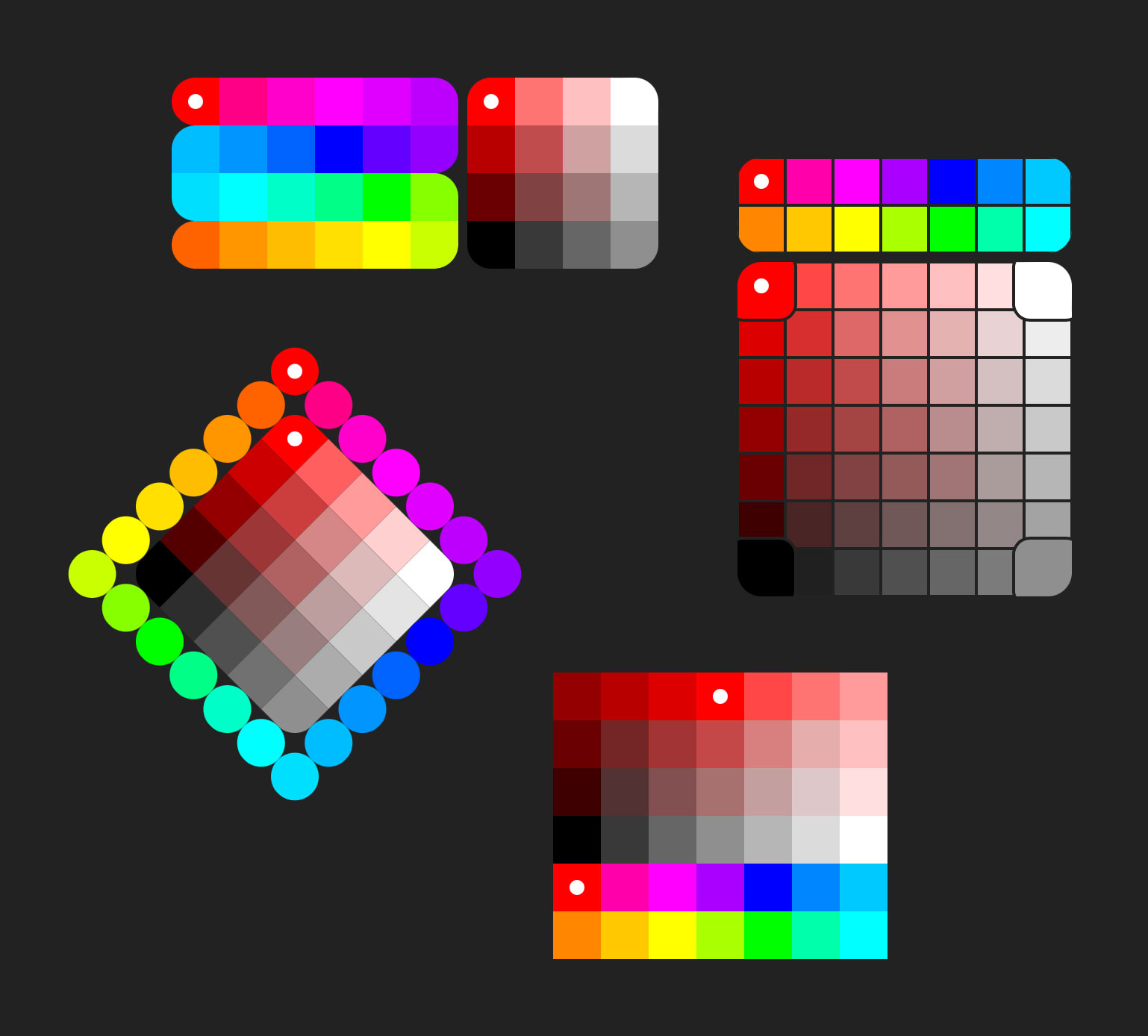
My “hue/tone” picker concept uses either a rectangular hue box that frames the central tone picker, or a serpentine path that wraps the spectrum within a rectangle while maintaining a full 360° range of consecutive hues.
To more easily zero in on a desired color, the hue picker changes to reflect the saturation and brightness of the currently-selected tone. (However, if the chosen tone is a pure gray and hue is irrelevant, pure hues are shown, with none selected.)
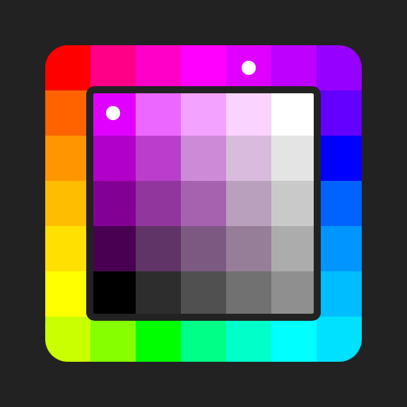
The hue picker starts with red (0°) at top-left, but you can specify a custom “Hue Offset” if you wish. For example, a 45° offset will move red to the top center
A better tone picker
I use the generic term “tone” instead of saturation–value or saturation–lightness, because my square tone picker doesn’t follow two axes in those traditional ways (with their large wasteful regions of near-black or near-white).
The tone picker has key tones at the four corners—pure color, black, white, and gray—and other tones are the interpolated between those. The left edge is always a scale from black to pure color; the top goes from pure color to white; and the other two edges are a generous gray scale. Everything in the middle of the square is the “grayish” tones that most swatch sets omit entirely.
A “Wide” variation is also offered, with pure color at top-center and the grayscale along the bottom. The top corners are midway between the pure color and black or white. This wide layout emphasizes more saturated tones and fewer grays, as well as fitting well into a narrow strip of screen space, so I am using this layout for my Mind Magnets app.
Hue spacing
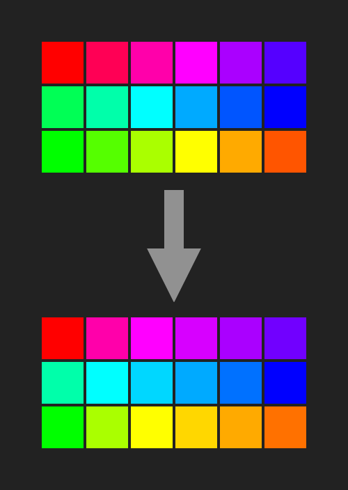
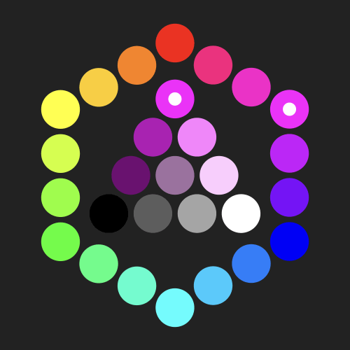
A mathematically even set of hues, fitting the 360° spectrum into a fixed number of swatches, has two problems: it’s likely to be missing some of the useful exact primaries and secondaries (RGB, CYM) and it clusters many similar hues around red, green, and blue, while lacking useful intermediate hues elsewhere in the spectrum.
This sandbox by default applies “optical” hue intervals: the six primaries are always present, and then the remaining slots are assigned using a custom weighting system, resulting in a different length for each of the six intermediate ranges. Within each range, hues are pushed away from primaries (where they would otherwise appear too similar) and towards secondaries, using a curve specified by the hue “Skew” value.
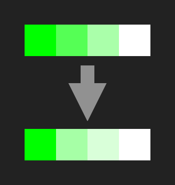
As a demonstration, watch what happens to the hues around green when you uncheck “Optical Hue Intervals” (top image here): although the intervals are mathematically regular, you can see multiple greens that are almost identical visually. The optical intervals in the bottom image fix that and allow more useful variations of oranges and purples.
Tone spacing
A mathematically even distribution of saturations and values gives dark tones that are too similar to each other. It also has too many tones that look pure and too few grayish ones: a pure color looks virtually unchanged when adding a little gray, while gray looks very different when adding a little color. So this sandbox uses multiple “skew” curves to achieve a better optical tone distribution.
“Skew” curves and hue adaptation
The skew values generate exponential curves, much like gamma functions (except they start at 0 for no effect, rather than 1). They are applied in various ways to hue, saturation, lightness, or brightness. The Saturation Skew for non-wide layouts also starts the curve offset by a fraction (determined by the skew value) of a color “slot” so the the least-saturated swatches are closer to gray and more usefully distinct.
Applying a single skew to all parts of the picker would make some areas look better and others worse. Instead, the Dark Skew number brightens dark tones between black and pure color, while Light Skew lightens pastels between pure color and white. Saturation Skew pushes more gray into the middle of the picker, and Gray Skew lightens the grayscale.
However, that approach looks best only for hues of mid-range perceived brightness—around red—and is not ideal for lighter (cyan, yellow) and darker (blue) hues. I experimented with skew values for different hues on a reasonably-calibrated wide-gamut display (Apple Studio Display), plotted the most appealing results on a graph, and arrived at a pair of linear equations that adapt the skew curves to any given color. The “Hue-Adaptive” option generates Light and Dark Skews unique to each hue and its perceived visual brightness (Q) at full saturation. (The “Low Offset” value pushes dark colors away from black, compensating for the darkest color swatch tending to appear optically too dark.)
The brightness weights that feed into this calculation are the last group of settings above. These are also used to determine whether the selection-highlight dot should be black or white. The default .75 threshold makes the dot white in most cases, except where that would be too hard to see against a light color.
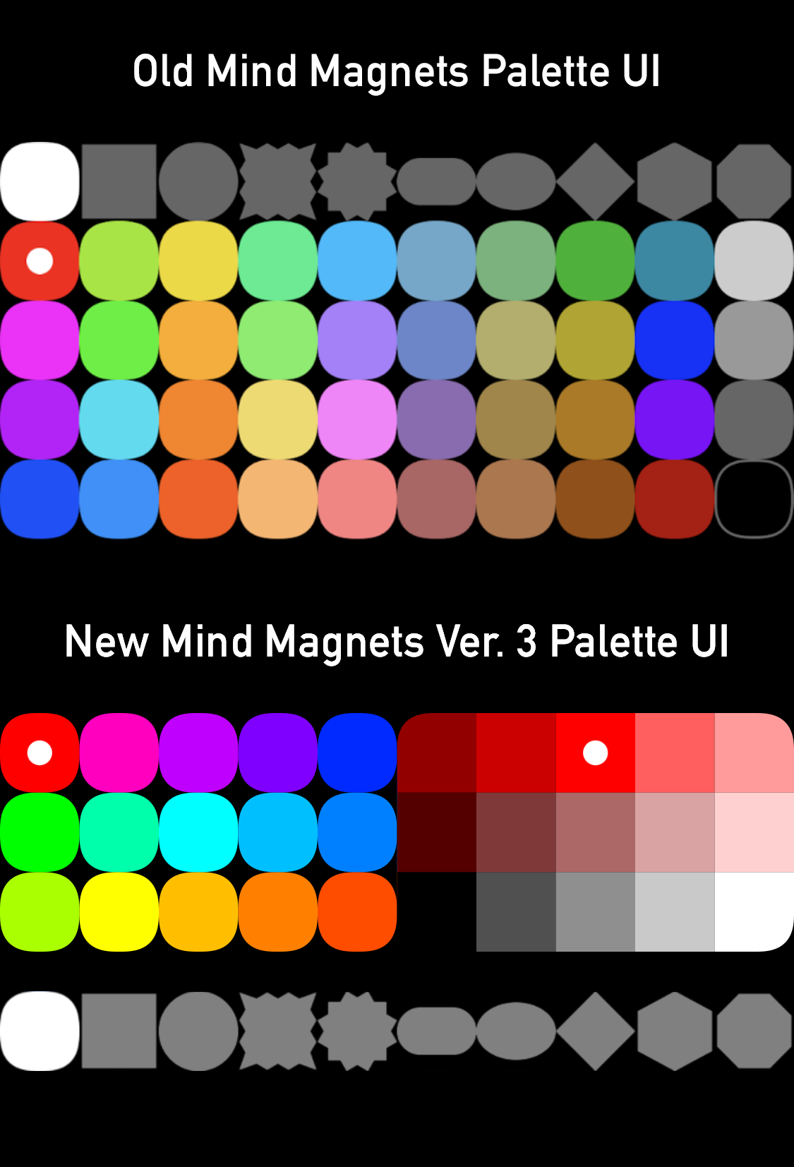
The Mind Magnets palette
For Mind Magnets 3.0+, I am using a 10 × 3 picker in “bar” layout (see the last Preset above) with 15 hand-curated hues and 15 tones. The inner 3 “grayish” tones are hand-curated, along with hue-specific offsets to vary the optical intervals between pure color and white. The 15 tones include a 5-level gray scale, 5 dark tones from black to pure color, and 5 pastel tones from pure color to white.
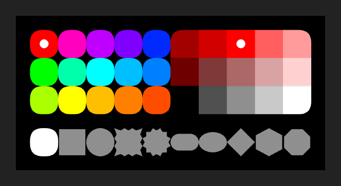
The new palette offers a selection of 155 colors, vs. only 40 colors in the old palette‘s less-organized 10 x 4 swatch set that takes up more screen space. (The hue swatches on the left reflect the shape of the current magnet, just as the old swatches do.)
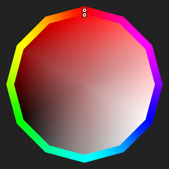
Other layouts
When interface space is not limited, a traditional HSV picker triangle can still benefit from quantized swatches and optical skews. This example uses a hexagon for the outer hue picker, making the primaries and secondaries easy to find while being slightly more compact than a circular ring.
Continuous-tone pickers
The same concepts could be applied to continuous-tone color pickers without discrete swatches. A square tone picker would retain the ability to quickly select useful tones such as pure color and pure black by dragging into a corner. For even more corners, the palette could take the form of a hexagon or dodecagon, with six or twelve easily-selectable points. The interior of the tone picker would be interpolated between those outer tones. The example mocked up here allows snapping to a pure hue, 25/50/75% darker variants, 25/50/75% lighter variants, and 25/50/75% grays, in addition to black and white. The outer hue ring has corners for selecting any primary or secondary color, as well as 50% blends between them.